Compare the design (in terms of pace and contrast) of an online magazine, blog or website to that of a printed magazine, book or journal.
- What differences can you see between the kinds of design strategies used in the two formats?
- Write down your findings and upload it to WordPress.
For this activity i choose the magazine and website for Shape-up. This magazine and website is about, exercise and lifestyle.
You can find the web version at the link below:
https://www.klikk.no/produkthjemmesider/shapeup/

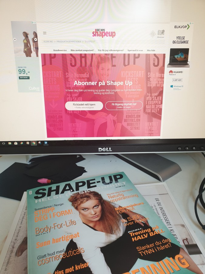


The web page and the magazine I think has some similarities, but its quite hard to compare it. The website is clear and tidy. With menus at the top of the page and neat elements on the rest of the page. The site has mostly three columns with some exceptions. It is made up of images and beginning text on the elements, which you must press to read the entire story.


The magazine varies between two and three columns mostly throughout the magazine. There are nice pictures put together with text that makes it clear but exciting and read. They often combine colors int the text boxes and pictures that are used in the story.
