Question 1.
- Having watched the video with Nigel French – describe, in your own words, what each of these colour systems means: RGB and CMYK.

The rgb system is additive colours, the primary colours are red, green and blue. These colours are made to generate colour on a screen such as computers and television. This means that these colours are made with the effect of light and colour.

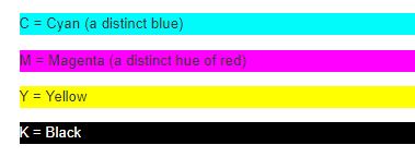
The cmyk system is the colours used for printing. Cmyk stands for the colours Cyan, Magnetta, Yellow and black. Cmyk colours are subtractive colours. subtractive colour method is when we`re mixing colours using paint or through the printing process. If you mix the four colours in the cmyk system you theoretically should get a black colour, however in reality you get a murky dark colour. K in black stands for key, as this is the key or plate you must have under printing.
2. Make use of Kuler and develop four different colour schemes. You must hand in screen shots of your schemes as done with Kuler:
- Monochromatic
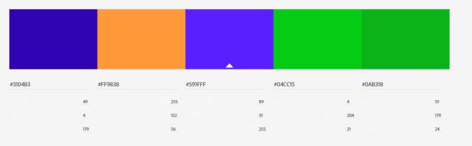
- Complementary
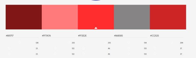
- Triadic
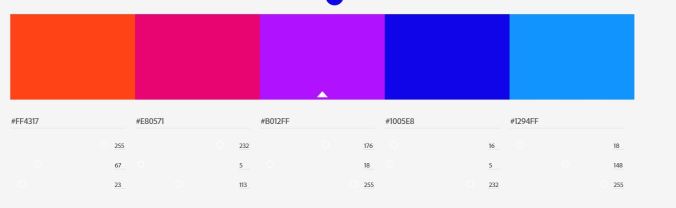
- Analogous
Monochromatic

Complementary
Triadic
Analogous
Question 2.
2. Make use of Kuler and develop four different colour schemes. You must hand in screen shots of your schemes as done with Kuler:
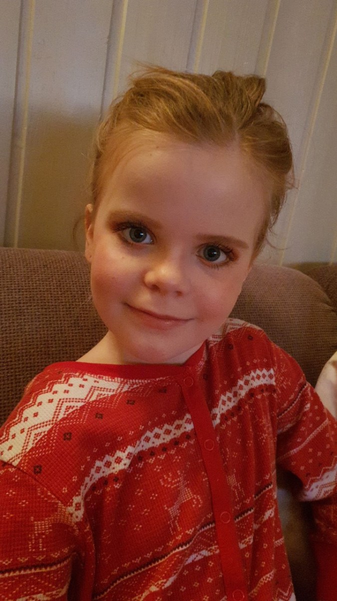
The original photo

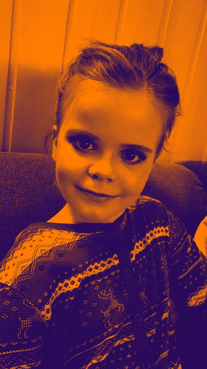
Andy Warhol look
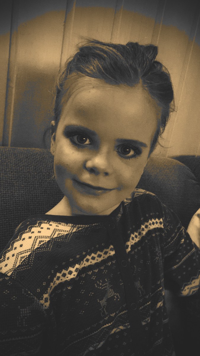
Sephia look
Split toning look
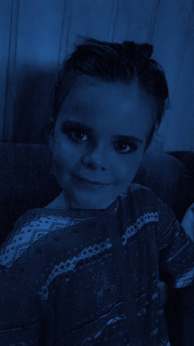
Freestyle
On this freestyle image I made a blue filter and adjusted the colors.
Question 3.
Practical activity:
- Design a book cover for one of the following:
a.) “To the Lighthouse” by Virginia Wolf: use complementary colours to express anguish and uncertainty.
b.) “The Maiden’s Tale” by Margaret Atwood: use analogous colours with a contrasting accent to express disagreement and discontent.
c.) “The Little Prince” by Antoine de Saint-Exupery: use secondary colours to express naivety, honesty and harmony. - The book cover must contain the title and the author’s name.
- You must clearly make use of colour to express the desired effects.
I chose The Maiden`s Tale by Margaret Atwood.

I redesigned a picture from when I searched around on google trying to find something regarding The Maiden`s tale. I found a picture from the series Handmaid`s tale wich is made from this book. I used a small part of the picture and made shadows, adjusted the colours and lightning to make contrast. I also made part of the picture blur to get a good express of discontent.
Source:
https://people.com/tv/margaret-atwood-handmaids-tale-sequel/
